Nick Braiden asked me to judge the writing on the 1 page comic contest he’s running on his Making Comics! Discord channel.
Happy to help.
And pleasantly impressed by the quality of entries. Good job, folks.
How I Judged
The primary method of judging was assigning a score based on the four fundamental comic elements of each panel (that I covet and teach);
- Emotion
- Comictography (shot/angle)
- Mise-En-Scene (visuals in the panel)
- Movement
Keep in mind that I judged not the actual scripts, but the final pages of completed comic. In this instance, writing has merged with art, and although my focus was strictly on the writing and story, it is nearly impossible to separate the two completely.
September 2019 results;
WINNER:
THE DEAL, by Frank N (art by Will P)
STANDINGS:
- Law of the Land & The Deal
- Guide on Human Abducting
- Untitled (Old Man)
- Sight
- Crossing Paths
* Law of the Land and The Deal actually tied in score. After secondary review, The Deal edged out Law of the Land by a hair.
Strengths/Weaknesses:
Beyond the primary four considerations, I assessed the following aspects from each story. In an effort not to over complicate things, I’m listing them here with either a simple weaker or stronger declaration. “Weaker” doesn’t mean horrible and “stronger” doesn’t mean no room for improvement;
Weaker means on the less effective side of the spectrum. Stronger means on the more effective side of the spectrum.
I’m also listing the strongest and weakest panels as well as any additional comments on the writing. Hopefully everyone can take something away from all the submitted works.
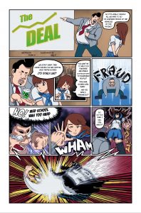 THE DEAL
Structure/Plot: stronger
Irony: weaker
Master Theme: weaker
Reveals/Turns: weaker
Pacing: stronger
Characterization: weaker
Dialogue: weaker
Conflict/Jeopardy: stronger
Stakes: stronger
Genre: weaker
Tone/Mood: weaker
Best Panel:
#5: High emotion. High movement. Funny dialogue.
Weakest Panel:
No real weak panels. #2 could use better dialogue.
Comments:
Great escalation, distinct narrative, and polar opposite change from opening to closing.
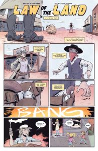 LAW OF THE LAND
Structure/Plot: stronger
Irony: stronger
Master Theme: weaker
Reveals/Turns: stronger
Pacing: stronger
Characterization: weaker
Dialogue: stronger
Conflict/Jeopardy: stronger
Stakes: stronger
Genre: stronger
Tone/Mood: stronger
Best Panel:
#8: The reveal of the story. High emotion from the kid.
Weakest Panel:
#1: Panel is fine, but the dialogue says what the reader is seeing–and this should generally be avoided.
Comments:
Succinct use of narration.
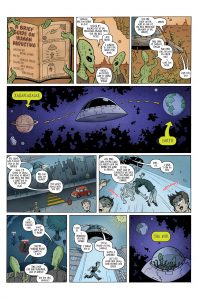 HUMAN ABDUCTING
Structure/Plot: stronger
Irony: weaker
Master Theme: weaker
Reveals/Turns: weaker
Pacing: weaker
Characterization: weaker
Dialogue: weaker
Conflict/Jeopardy: weaker
Stakes: weaker stronger
Genre: stronger
Tone/Mood: weaker
Best Panel:
#7: Best exchange of dialogue–Coment, reply, follow up comment.
Weakest Panel:
#4: It’s pretty, has some humorous undertones, and helps set the mood, but ultimately, is not required to tell the story. Removing this panel would not break the story.
Comments:
* A major problem is that this narrative is missing conflict. Without conflict there is no story.
* Missing a distinct climax.
* I found the first panel really funny and immediately held high expectations for a lot of laughs. Unfortunately, they didn’t materialize. <Humor is hard.>
Remember, the opening to your comic is the place you make promises to the reader and set expectations. You must live up to all the promises you make.
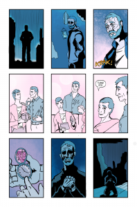 UNTITLED (Old Man)
Structure/Plot: stronger
Irony: weaker
Master Theme: weaker
Reveals/Turns: weaker
Pacing: weaker
Characterization: weaker
Dialogue: weaker
Conflict/Jeopardy: weaker
Stakes: weaker
Genre: weaker
Tone/Mood: stronger
Best Panel:
#8: Highest emotion. *Edit: Corrected mistake, originally listed panel #5.
Weakest Panel:
#1: Says very little visually.
Comments:
* Notice how similar the first and last panel are. A story without change, is a dead story. How would the story read if the first panels showed the old rich and well off.
* Here’s the problem with a lot of silent pages–they rely too heavily on subtext.
While subtext is essential to a good script, burying everything in subtext can quickly make the story so abstract, so open to interpretation, it becomes hard or impossible to follow.
- Is that the father as an old man, or the son?
- What’s in the box and why is it relevant? I could come up with many conflicting ideas of what could be in that box.
- What’s the significance of 5 minutes to 5?
- Clearly the old man is in grief, but there is no context as to why he’s feeling grief.
* Overall there are many missed opportunities to shape the narrative.
* STRONG mood in this story, enhanced by the color pallet. (Kudos if the writer recommended the colors.)
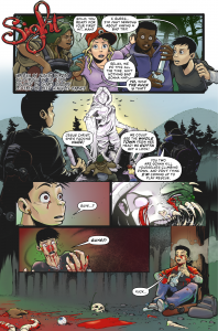 SIGHT
SIGHT
Structure/Plot: stronger
Irony: stronger
Master Theme: weaker
Reveals/Turns: stronger
Pacing: weaker
Characterization: weaker
Dialogue: weaker
Conflict/Jeopardy: weaker
Stakes: stronger
Genre: stronger
Tone/Mood: weaker
Best Panel:
#6: Climatic conclusion that uses visuals to tell/show the story. Unexpected change from opening.
Weakest Panel:
#6: Lost opportunity to pull the story together through dialogue.
Comments:
This was also a very strong contender.
* Redundancy should only be used when you really want the reader to get something. If it’s not super important, avoid redundancy.
* Dialogue drowning in abstract subtext;
“Hey I’m a car thief and I’m stealing your car.”
“What?”
“What?”
“What?”
“What?”
This works for a stupid 30 second commercial played 10,000 times a day, but it doesn’t work for a comic where you’re trying to convey narrative and control the reader’s experience.
* The comictography on this page is lacking. Everything is basically straight on, eye level shots. Switching shots and angles to support and emphasize the narrative could have made a dramatic difference here.
If the writer did not include any comictography, it goes to show you how an artist who doesn’t receive any camera direction can drop the ball a bit.
If the writer did include comictography, it goes to show you why you need to know your shots and angles and how to use them.
Newer writers shouldn’t worry about comictography, if your artist flubs it, he flubs it, but if you want to practice your ability to direct the camera, as an exercise identify the most important panel from each scene in your comic. How can you emphasize and support what you’re trying to say narratively in that panel through the shot and angle it’s illustrated?
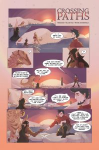 CROSSING PATHS
Structure/Plot: weaker
Irony: weaker
Master Theme: weaker
Reveals/Turns: weaker
Pacing: weaker
Characterization: weaker
Dialogue: weaker
Conflict/Jeopardy: weaker
Stakes: weaker
Genre: weaker
Tone/Mood: weaker
Best Panel:
#8: Visual compliments the dialogue.
Weakest Panel:
#6: The lizard man’s dialogue has no relevance. The mermaid’s illustration does not support the swordsman’s dialogue.
Comments:
* Best use of close ups out of all entries.
* There’s an old rule in Theater, don’t turn your back to the audience. It’s a good general rule for comics. Instead of looking at the back of a character’s head, it’s far more interesting to look at the front.
* If you focus at the conclusion of this story; a swordsman helps a mermaid cross a shallow of rocks in a river… the beginning of the story should have focused on the mermaid struggling to cross the river.
You can further make a story more interesting and more effective by having a Master Theme.
In this instance, if the mermaid’s struggle and swordsman’s aid were anchored by a Master Theme, the entire narrative (beginning, middle and end) would be united. For example, if you set the Master Theme of “No good deed goes unpunished”, do any new visuals jump out at you?
CHIPS SAVE!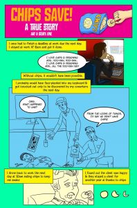
Structure/Plot: weaker
Irony: weaker
Master Theme: stronger
Reveals/Turns: weaker
Pacing: weaker
Characterization: weaker
Dialogue: weaker
Conflict/Jeopardy: weaker
Stakes: weaker
Genre: stronger
Tone/Mood: weaker
Best Panel:
#2: Humor high point.
Weakest Panel:
#3: Dialogue is On the Nose.
Comments:
* Humor is evident but could have been more effective with further developed writing. When going off the deep end with humor–chips were the cause of the protagonist’s success, not hard work and skill–look for places to contrast with serious tone material. (In essence this is what takes place in the second panel, but could have established more throughout the other panels.)
* Stakes would have also emphasized humor. Just an extra line of narration could have clued the reader into why it was so important to keep the client.
* “Without chips it wouldn’t have been possible.” This is telling the struggle, instead of showing it. How funny would it have been to actually see this line expressed in a few panels visually? I’ll tell ya, really funny.
Again guys, great submissions.
Don’t take anything I say personally. The insight into the stories is to help everyone write better and in the circles I run in, I’m known as a tough critic 😉
▪
About the Author —
Nick Macari is a full-time freelance story consultant, developmental editor and writer, working primarily in the independent gaming and comic markets. His first published comic appeared on shelves via Diamond in the late 90’s. Today you can find his comic work on comixology, amazon and in select stores around the U.S. Visit NickMacari.com for social media contacts and news on his latest releases.
