Most of the comic stories that hit my desk these days are more involved than lots of the serial stuff we grew up on.
To an extent, this is the medium (and the writers themselves), growing up.
In order to stuff these more complex narratives into 22 pages, I see a lot of newer writers skip on the full page art pages. They cling to 6 panel pages with white knuckles, the thought of sacrificing all that story real estate for a single panel, blasphemous in the highest order.
Of course, ditching full page art pages in your floppy or graphic novel is a major faux pas and should be avoided at all costs.
While I’ve spoken to the importance of full page art pages elsewhere, I thought I’d break down some further consideration on how to use them effectively.
Eye Candy / Vanity Pose
The most common use of a full page art page takes place when the writer simply wants to showcase something they think is cool.
Often this is the climax moment in a fight, or stunt… or an establishing shot for a unique location/environment. Another really common piece of comic eye candy are, as I call them in my article of scripting proper fight scenes, “Vanity Poses.” This is where you showcase a character, usually literally giving a dramatic pose or flex, just before a fight-though they pop up from time-to-time as a general character introduction or brooding moment.
Eye Candy/Vanity Pose full pages are usually superficial in nature–plainly put, most writers don’t put a lot of thought into them, again just focusing on a “cool visual.” At the same time, these full page arts can be one of the most effective, long-term visual associations to a character or book. Just ask any comic book collector/reader and your bound to get at least a handful of responses to full page arts that just stuck with them…
 While we can remember our favorite artists style, over the course of reading hundreds, or thousands of works by them, it’s far harder to remember the small panels.
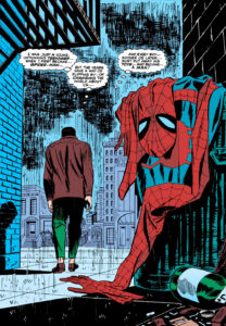
I’m sure most of the folks reading this article have put eyes on the iconic Amazing Spider-Man #50, where Peter Parker walks out of the alley with his spidey suit left behind in the trash or the famous image of Bane breaking Bat’s back.
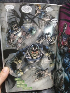
Panel Left: This is a perfect example of a vanity pose full page. From DC’s the Blackest Knight. In this particular example, we’ve got a group flex, quite often the vanity pose applies to a single character.
Pace Breaker
When writers put a bit more thought into their full page art pages, it usually comes specifically for the pace of the narrative.
Full page art has the wonderful ability to speed OR slow pacing.
Pace breaker pages, again often come during a climatic action sequence moment, where the art is used to speed up the pace. The core intention of the art page, not to flood the reader with details to stew over, but hit them with an intense visual, that delivers a narrative point instantly, and pushes them along with haste. The Bane art above is a perfect example of this. The art is not very detailed at all. The background is nothing more than a basic simple color gradient. The art slams you in the face with dramatic impact, then beckons you to move on to the next page.
In contrast, full page art can also do the exact opposite.
In this instance, not usually in a fight sequence, the pace breaker page DOES flood the reader with details to stew over. This “Where’s Waldo” approach gives the reader levels upon levels of detail. Ample material to stop, or at least slow down, to take everything in. Perhaps even getting lost in the page!
Now that we’ve covered the most common takes when it comes to full page comic art… let’s cover a couple of other more specific (and useful) versions to keep in your writer’s toolbox.
The Emphasizer
In comics, there ain’t no better place to make a point, then with a full page of art. Full stop.
This is the part where it’s not so much about the visualization itself, but rather, the meaning behind the visualization.
She-hulk punching the head off a robot. Awesome sauce. That could make a great full page action piece… but, that’s not telling us too much, except for maybe She-hulk’s strong disdain for technology.
In contrast, what if we see a full page art of Jennifer Walters, in the court room, doing her lawyer thing. Ahhh, now we’re learning something. In this case, not only that She-hulk is a lawyer, but maybe that she’s a really good, successful one.
If you’ve got a message you want to make sure the reader notices, doing it in a full page art page is the way to go.
In a sense, you can think of all panel sizes directly proportional to the weight at which the narrative message is conveyed. If you had a single, small panel, on a seven panel page, of She-hulk winning her court case, it would never hold as much impact and influence to the reader, as conveying that same message in a single full page panel.
(Or if you want to be super accurate, to make a single small panel have as much narrative weight as a full page, the writer would have to jump through a lot of hoops and work REAL hard to establish a special context to make that happen.)
Use emphasizers to hit home an important point in the narrative. To bring that element into the reader’s conscious field of perception.
For example, in our issue of She-hulk, maybe she does something key in the issue that relies on her ability as a lawyer–maybe toward the end of the issue, she cites part of the legal process to deduce that a bad guy will be a certain place at a certain time trying to dispose of evidence. This deduction could come across confusing, misunderstood, or as deus ex machina, if the reader doesn’t make the connection that she has the ability to do this because of her profession. If the reader hasn’t followed the series for a while they might have completely forgotten She-hulk’s a lawyer, heck, they might be new to the series and not even know she’s a lawyer!
Emphasizers and Narrative Drive
You can use a emphasizer full page to emphasize anything in the narrative. Maybe you want to emphasize the tone in a scene, or maybe you have a key moment of characterization. Anything you want to stress to the reader is fair game for an emphasizer full page art page…
However, keep in mind that the most effective emphasizers contain narrative drive. They don’t stop the entire story to highlight one element, but instead, highlight that one element, while presenting specific narrative relevance to keep the story moving forward.
This is where your planning, plotting, and story structure come into play at the pro level.
For example, let’s say you were doing some sort of gothic vampire horror story. If you wanted to have a an emphasizer page focusing on the tone and mood, you might showcase a full page art of the underground catacombs, beneath the castle. But the setting alone doesn’t really have any narrative drive… adding corpses on the wall of knight crusaders. Perhaps that ties in your narrative point that the vampire here has been killing for centuries… and has a bone to pick with Christianity, which is central to the story unfolding. Alternatively, perhaps you take the emphasizer page to finally reveal the identity of the vampire and in turn raise the stakes of the narrative from hunting a rando vampire, to hunting Count Dracul himself.
Clues
Again, we have a use of the full page that relies a bit more on the meaning behind the actual visualization.
In this instance, we use the full page to deliver an important bit of information to the reader, but it’s delivered in subtext or otherwise obscured a bit, so it’s not blatantly obvious, as with an Emphasizer page.
Obviously, clue focused full page art suits itself to mystery and thriller fiction… or at least, similar toned elements within a broader genre.
Whether you make your clues more or less obvious for the reader to pick up on, it’s much more efficient and effective to drop your important clues in a full page art. Even the best planned and best detailed smaller panels of a multi-panel page, can be easily overlooked.
Having written a whole bunch of Sherlock Holmes stuff myself, I can tell you ‘cluing in the reader’ is something you have to get right! If your clues are too small and easily missed, you wind up with a lot of pissed off readers. Very few people in the real world like to solve REALLY REALLY hard puzzles… as it turns out, lol.
Keep in mind clue focused full page art isn’t ONLY for mystery and thriller fiction. Any narrative that makes use of symbolism can employ full page clue focused art with great effectiveness.
Clue full page art doesn’t have to solve a crime, or lead to the core reveal if such a puzzle is the engine of your narrative. Clue art can answer other questions or otherwise support the narrative: justifying subplots, clarifying characters, or just about anything else that needs some level of connection, foreshadowing, justification, or explanation.
Lastly, keep in mind most folks enjoy discovering things. They’re called Easter Eggs in gaming. Throwing something random in a full page art as a clue is always fun, but connecting it somehow to the narrative is how you actually put it to work and reinforce good storytelling.
Book Ends
Back in the day a lot of comics opened with “Splash Pages.” Most newer comic writing folks think any full page art is a splash page, but that’s incorrect. Splash pages were specifically the opening, full page art pages to an issue.
Anyways, Splash Pages and full page final pages were used to grab the reader’s attention. They almost always emphasized a narrative hook. The Splash Page hooking the reader to commit to the issue, the final full page art hooking the reader to commit to the next issue.
I’ve got a solid article on hooks so I won’t go into those details here.
Book ending your issue with full page art can be extremely effective, particularly if you have a follow up issue or continuation story for the reader to snag.
The downside with book ending your issue with full page art is that you’ve fired two of your full page art bullets. Most writers have extremely limited full page ammo in their comic writing arsenal on any given floppy issue. If you don’t add any more full page art pages to your book, you’ve got nothing to work with within the interior of the issue! And realistically, how many can you add after you’ve put one in the beginning and one at the end?
While full page art pages are extremely effective and necessary tools… at the same time, they do eat narrative real estate. Especially the Eye Candy fight scene ones. When book ending an issue, your writing on the rest of the issue has to be extra tight and effective.
Too many newer comic writers don’t give full page art the attention they deserve.
Heck, I myself have been known to script an issue, go through and do my panel count assessment pass and scream, “Shit! Where are my full pages?”
But I always go back and work them in. Always. And you should too!▪
About the Author —
If you enjoy this article, please share the direct link on your social media.
Newcomer or veteran writer, if you’re working on a project that needs commercial success, Nick urges to you read this intro article.
Nick Macari is a full-time freelance story consultant, developmental editor and writer, working primarily in the independent gaming and comic markets. His first published comic appeared on shelves via Diamond in the late 90’s. Today you can find his comic work on comixology, Amazon, and in select stores around the U.S.

