I always find it insightful to stop, take a moment and really look at the trends of comic writing. Not just the trends going on today, but the trends that have come and gone over the years.
Below is a collection of just such data.
Keep in mind, I’m not a mathematician or statistics guru.
My process for this research included selecting 10 random issues from the specified decades. I then jumped to pages 6,11,17,22 and 27—using whatever content those pages contained. If I landed on a full page art or advert, I moved to the next page before or after (randomly picked)—if the book stopped before page 27 (or 22) I opened the comic to a random page and used that page as substitute.
A 50 page snapshot probably doesn’t paint the most accurate picture in the world, but I still believe it can tell us something.
If you’re like me, you may find the results absolutely fascinating.
Word Counts Per Page:
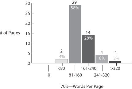
(That’s pages with less than 80 words total and more than 320 total on the ends of the graph.)
versus today… This just blew my mind.
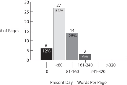
yeah, that’s 6 pages out of the 50 I flipped to in modern comics containing zero dialogue or narration on them.
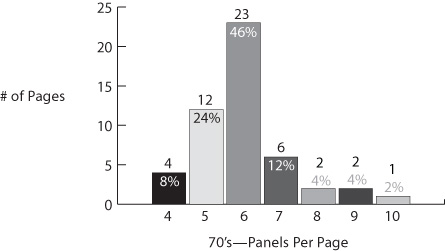
Panels Per Page:
versus today…
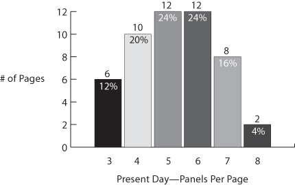
While I always strive for 3-5 panels a page, 6 does seem to have a special connection balancing art and story in just the right proportion. Seems like it’s been that way since the beginning.
If you thought words per page was an eye opener, wait till you take a look at:
Words Per Panel:
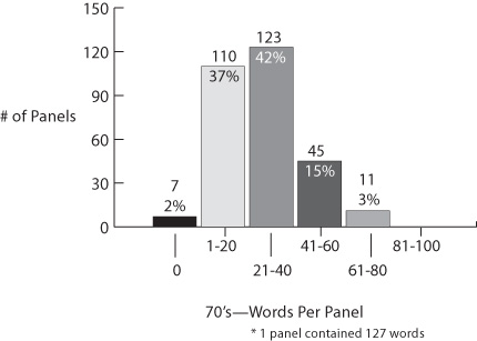
compared to words per panel present day….
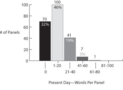
Seems like these days comics are a much more visual medium than days of old.
Opening Splash Pages:
10 out of 10 comics from the 70’s opened with full page art.
versus today, only 2 out of 10 modern books sampled opened with a splash page.
Caption Density:
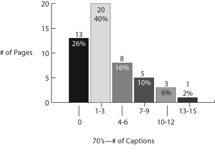
74% of 70’s pages had at least 1 caption on them.
18% (not far off from 1 in 4), had between 5 and 15—that’s a dense usage of captions.
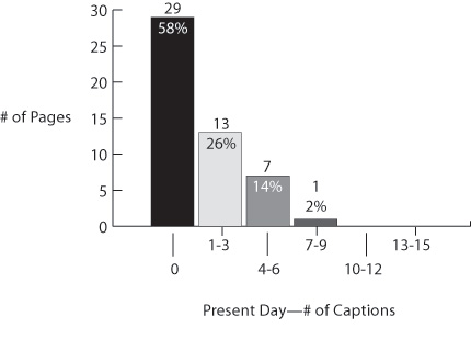
Today it seems as though captions have mostly gone the way of the dodo, with a whopping nearly 60% of pages having no captions at all.
84% of pages had no more than 3 captions, and only 1 page out of 50 sampled had more than 6 captions.
Thought Bubbles:
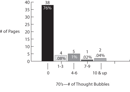
This graph is a bit misleading in that, although the density of thought balloons was not very high, in other words they didn’t appear on every page, they were in fact commonly used. The fact that 3 of the 50 sample pages had over 7 thought bubbles eludes to the fact writers of the time were not afraid to use them.
To further illustrate this point, 4 of the 10 issues sampled had 28 – 69 thought bubbles throughout the entire issue. 69 is a lot of thinkin’!
In stark contrast, only one thought bubble appeared in all the sample pages of modern books (21st Century Tank Girl).
As a sidebar, it’s also interesting to note, that thought bubbles were not exclusive to the heroes. Writers of the time, tended to throw them out for villains and secondary characters however they saw fit.
Page Numbers:
Every single issue of Modern comics did not have page numbers (thanks guys, way to make this article exceedingly difficult 😉
In contrast, every single issue of the 70’s books, did have them.
Cover Trends:
The differences in covers between the 70’s and modern books is drastic to say the least… In fact, I’d go as far to say, from a cover stand point, modern comics look nothing like their former selves.
Consistent Design
First and foremost, comics from the 70’s across the board almost had a nearly identical layout (varied a bit from publisher to publisher, but even then, shared similar design/layout elements). For Marvel, we recognize this as the Comics Group banner across the top, followed by the title and taglines, the price and issue number boxed on the left, with an art showcase of the main character underneath.
In contrast, not one of the modern books shared anything with one another as far as design layout. There is no longer any consistency with the placement or really even the elements themselves.
Taglines
50% of the 70’s books contained tagline slogans, like “Red Sonja: She-devil with a Sword” or “They Came from Inner Space: Micronauts” In fact, I believe the density of taglines from this era was even higher, a couple of the 70’s books I randomly grabbed were adaptations (Logan’s Run and John Carter) and one was a Marvel Premiere book. So if you threw in 3 other serial hero books, like “the Invincible Ironman”, “the Amazing Spiderman”, or “the Incredible Hulk” I believe more like 80-90% of books from back in the day had taglines.
Again, in contrast, not one single issue of the modern comics showcased a title tagline.
Creator Names
Zero creator names on all 70’s books.
Every modern book showcased creator names.
*** Pet Peeve alert: It’s always been a pet peeve of mine when books (usually indie) showcase creators you’ve never heard of on the cover. The cover is attraction. Everything there is suppose to lure and seduce, sell you on grabbing the book. Names of people with large fan bases make sense, because those names actually work to those means. But folks you’ve never heard of just detract from the cover’s purpose… Of course all comics have credits inside, usually on the first page or two, so it’s not like credit isn’t being given where credit’s due. Back to the regularly scheduled programming…
Interior Scenes Subject Matter
70% of the 70’s issues showcase art that directly reflected content within the issue. So in Logan’s Run, the main guy has a fight with a bunch of savage kids. The cover shows him being surrounded and attacked by the kids. It’s as if the cover artist selected an actual panel from the book and stuck it on the cover (not the case literally, but in essence).
Dialogue Bubbles
30% of the 70’s issues showcase actual dialogue bubbles on the covers. Again turning to the Logan’s Run for example, the main guy is screaming “Watch out Jessica, these children have gone wild–and they’re trying to kill us!”
Interesting to note while it’s usually only 1 or 2 bubbles, sometimes, it was quite a few… the Nova cover had 4!
Call Outs
This one was interesting. 100% of the 70’s books had call outs. John Carter’s reads “Savage Fury from the Creator of Tarzan!”, Conan’s reads “The Beast King of the Black Coast!”
While I had an idea most comics of the time used them, I didn’t realize the exact frequency, and the fact that 60% of them actually had 2! Books back then really made a go at selling the experience.
In contrast, NOT ONE modern book used interior scenes, dialogue bubbles or call outs. Go figure.
###
I might do an action vs static panel or some sort of content trend assessment, but not totally sure.
At the end of the day, you may find past trends of little significance in writing today’s market. There might be some weight to that argument—focusing on what the market expects today may be the fastest way to retain relevancy as a professional…
That said, I think of knowing where the industry’s been and how it landed where it is today, as empowering if not plain useful. You never know when you’ll be tapped (or inspired) to put together a retro book and need to mimic a specific time in comic history.
1970’s Issues Used:
Red Sonja #3 – Roy Thomas & Clara Noto
Marvel Premiere #22 – Tony Isabella
Conan the Barbarian #94 – Roy Thomas
Logan’s Run #2 – David Kraft
John Carter: Warlord of Mars #1 – Marv Wolfman
Nova #9 – Marv Wolfman
Machine Man #10 – Marv Wolfman
Micronauts #1 – Bill Mantlo
Marvel’s Greatest Comics #82 – Lee/Kirby
The Destructor #4 – Gerry Conway
Present Day Issues Used:
DK 3 Master Race #1 – Frank Miller & Brian Azzarello
Old Man Logan #1 – Brian Bendis
Past Aways #7 – Matt Kindt
The Rocketeer At War #1 – Marc Guggenheim
21st Century Tank Girl #1 – Alan Martin
GI Joe #1 – Karen Traviss
The Fadeout #1 – Ed Brubaker
Rebels #5 – Brian Wood
The Wicked & The Divine #1 – Kieron Gillen
Drive #1 – Michael Bendetto
Compiling the data and making these charts takes a hell of a lot of time.
Phew! Well there we are. This page took a million hours to put together. Originally, my plan was to do this for the 80’s and 90’s too… but to be honest I’m beat. If I get a second statistics wind, I’ll take a crack at it and send up a flare to let you guys know.
(If I missed any specific trend or area of comic writing you want to see for 70’s to modern comparison, leme know and I’ll try to find the time to come back and include it). ▪
About the Author —
Nick Macari is a full-time freelance story consultant, developmental editor and writer, working primarily in the independent gaming and comic markets. His first published comic appeared on shelves via Diamond in the late 90’s. Today you can find his comic work on comixology, amazon and in select stores around the U.S. Visit NickMacari.com for social media contacts and news on his latest releases.
3 thoughts on “Comic Writing Trends”
Comments are closed.