As a freelance writer you might not be tasked with conceptualizing a book’s cover too often–much of the time, the person hiring you prefers to handle that themselves. Publishers/creators just generally want to have ownership of it and I think, most of them find it an enjoyable part of the comic making process.
Of course, when you are the publisher/creator, the cover concept is likely to fall squarely on your shoulders. At least, initially… your artist may chime in, if they are so inclined and/or if you have the budget for their design input.
The cover is arguably the single most important part of the comic. If the cover doesn’t convince folks to pick up the book and at least consider buying it, nothing else inside the book matters.
And there in lies the rub of the cover design conundrum;
If someone handed you a million dollars and said, “Oi mate, I love your work. Produce your comic series for the next two years!” It wouldn’t matter in the slightest what you put on your cover. You could do a full bleed solid color of green and nothing else, and it wouldn’t fuck all matter, because you’ve got all the money you need to produce your entire series, even if you never sell a single issue…
But, unless you know a rich, crazy Aussie, suddenly, it DOES MATTER if anyone buys your book. Well at least for most of us.
So the cover isn’t just about looking pretty… It’s about convincing people to pick up the book, to get them to glance through it and consider handing over their money to buy it.
This is the goal of a cover for the indie comic creator.
Covers are the first impression you deliver to your customer.
Covers sell books… or not. Period.
In my article on opening scenes, I break down the considerations of keeping a reader engaged–earning their trust to buy the book or at least keep reading based on the books first scene. Much of what I discuss there applies to the cover itself.
- selling the story
- setting a hook
- making promises
- highlighting conflict/tension
- implying the theme
- integrating symbolism
Ultimately, you can look at a comic cover solely as a stand alone piece of art, something (abstractly or directly) symbolic of the story, or vibe of the story as it were, OR, you can look at the comic cover as a more direct preview/teaser of the narrative within. Or somewhere between the two.
If you’re earlier in building your brand (or IP), the most effective cover is one that conveys information. Unlike in other areas of writing, where too much can work against you–diluting a message or overwhelming the reader–in the cover, the more information you convey, whether its the narrative’s mood, tone, style, plot, setting, protagonist, theme, etc… the better.
To put it simply; the more information you convey, the more succinctly it’s conveyed, the greater your chances to hit on something that connects with the viewer and convert a browser into a customer.
If a potential customer doesn’t know anything about you, your brand, or your book, they are less likely to snag your book based on a pretty cover alone. Even a really well done pretty cover.
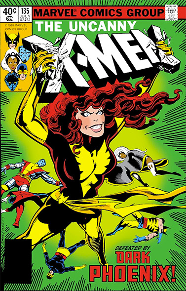
Back in the day, covers often utilized speech bubbles and captions to really sell the issue. (Notice how many points on my opening scene list, these old school covers hit with the information they relay.)
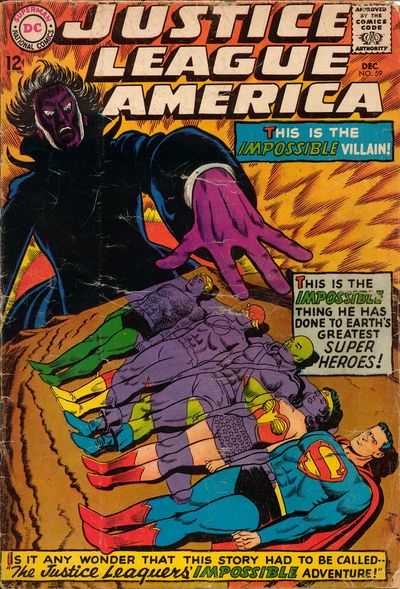
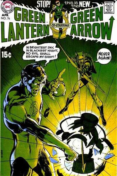
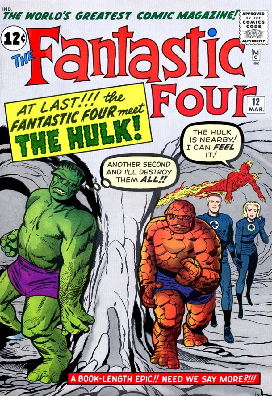
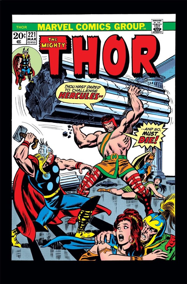
Selling your issue primarily falls on expressing to the reader the content it contains. Think of it as a mini-preview of the story’s core.
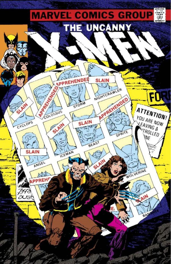
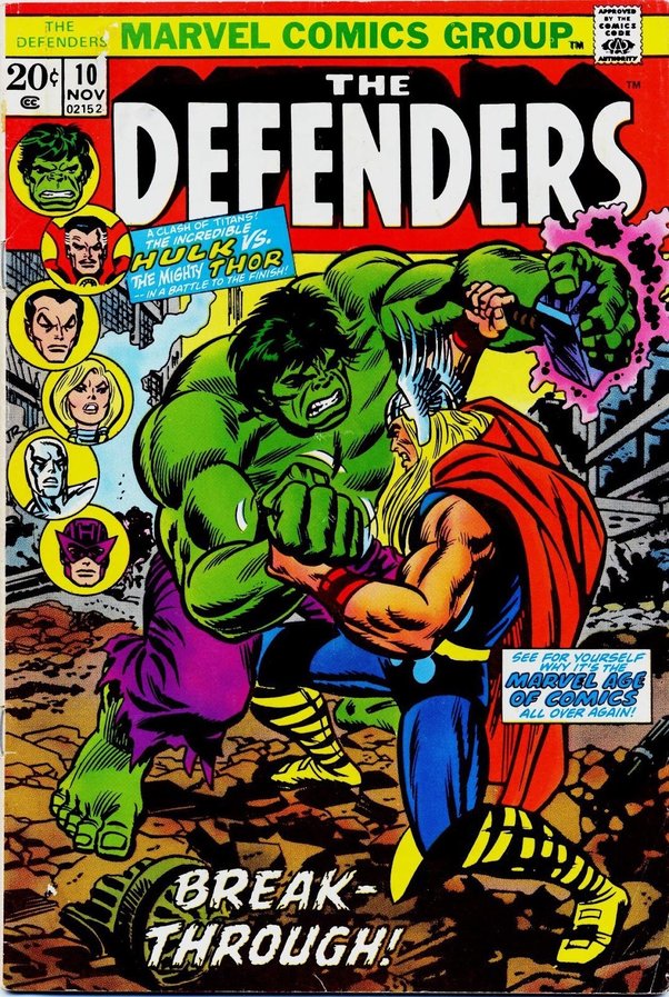
All these covers showcase conflict, a hook, and make clear promises to the reader. If you read Thor 221 and DON’T see Thor and Hercules go at it, you’d be awful upset.
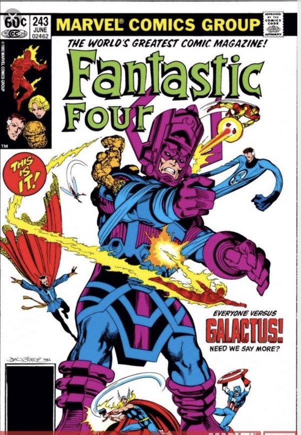
It’s also interesting to note that Marvel/DCs earlier books relied much more on selling the specifics of the issue than modern books. Clearly, they had not yet become the iconic franchises we recognize today and REALLY DID NEED to sell each story to potential readers. Today, big publishers like Marvel/DC can fall back on selling, or even emphasizing the characters themselves and don’t really need to sell the stories at all. Just like modern blockbuster movies focus on slapping A-list actors on their posters. “Hey don’t worry about the story, Tom Holland’s in it!…”
Since big publishers working with iconic characters have WAY MORE maneuverability than you do in the concepts and designs, be careful trying to mimic their approaches to modern cover art these days.
While Marvel could slap a headshot of Spiderman on a white background and still sell a crapload of books. If you slap a headshot of your barbarian character, Gonan on a book, your results are likely going to be far less rewarding.
A’ight, let’s break down some cover styles:
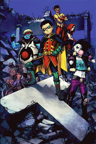
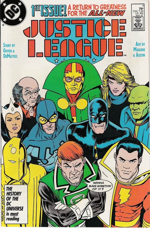
Family Portraits
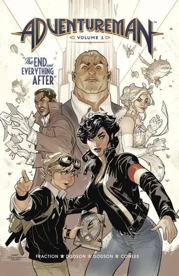
Family portraits, or static group shots are often the laziest, least inspired covers around.
While you may be able to relay information in the subtleties, it’s pretty much the least effective means to do so. Potentially effective when the audience is already familiar with the characters, but as an indie creator, most likely pushing new characters for the first time, the static nature of a group of people really is going to be a hard sell.
In my article on ultimate fights, I refer to these types of panels as Vanity Shots. Visuals that say, “Yo, check me out! Just look at me–nothing else matters. Ain’t I fabulous!”
Family portraits put tremendous emphasis on the art itself and design of the characters. If these elements aren’t mesmerizing, you’re in big trouble. Much of the time, these type of vanity shots aren’t really expressing much, if any message, they’re merely trying to grab your attention with faces and characters you already know.
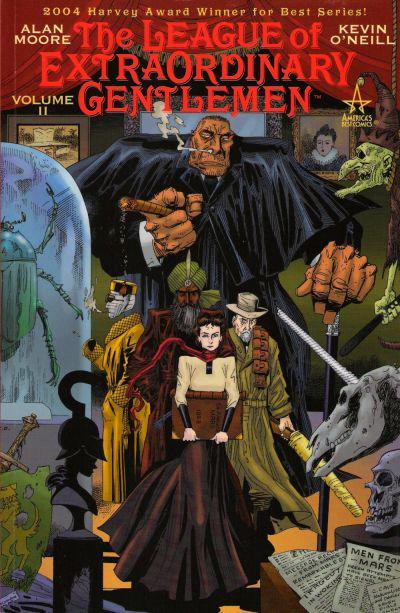
When the audience isn’t familiar with your characters, you’ll be relying almost entirely on their dress and design. It can work, especially if you’re working in a real niche genre, like period London for example… but again, on its own, with no other considerations (discussed later), Family Portraits are an “uninspired” route to go.
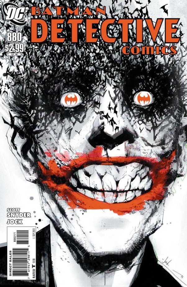
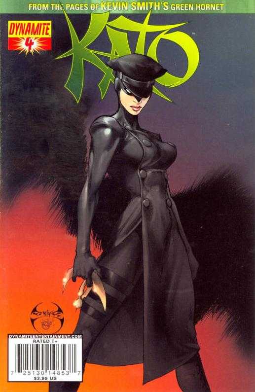
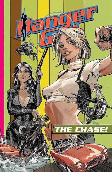
Headshots and Personal Portraits
Directly related to Family Portraits are the idea of individual headshots, full body shots of a limited number of characters, or a mish-mosh collage of both.
Again, while you can relay some information with these approaches, conceptually, like family portraits, they are a far less engaging approach.
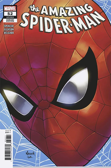
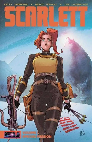
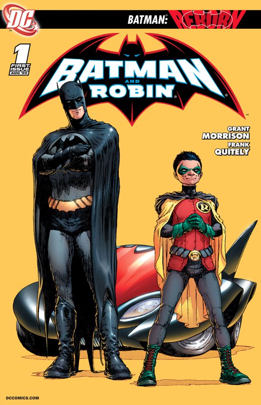
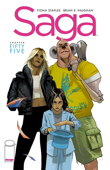
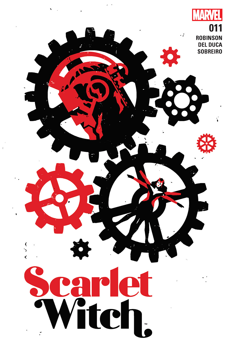
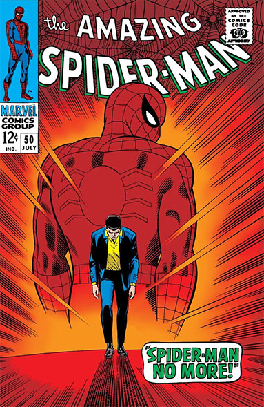
Headshots and personal portraits are even more disadvantaged than family portraits, because they afford even less room for the subtleties to express your message. I mean look at this Amazing Spider-man 52, the ONLY message I get from that is, “Oh shit, I have a cover due tomorrow!” The Scarlett, Batman & Robin, and Saga covers below, really don’t say anything, their value, besides the art quality, is merely to get instant recognition from a ways off in the store.
At least with Family Portraits, you usually have “more things” to look at, more chances to convey a range of emotions and characters. If you’re gonna even attempt headshots or personal portraits, absolutely make sure the cover design is supported by one or more of the elements discussed later on.
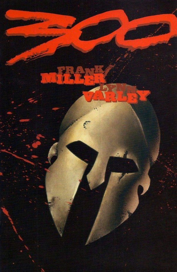
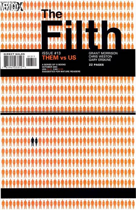
Symbolic
Symbolism is a great thing to work into a cover… but in indie circles, you have to be careful the symbolism isn’t lost on your audience.
Here’s a few covers that rely 100% on symbolism. If you don’t know what the symbolism stands for, if you don’t have the context, the covers make little to no sense at all.
Symbolic covers can be particularly effective when people love or really relate to the symbol. Minimalistic symbolic designs are often used in teaser material for just this reason, to get the core fan base hyped up. But in indie circles, you’re not likely to have your symbols established yet.
Don’t fall into the trap of thinking your stuff is so cool, people are gonna fall in love with your symbolism BEFORE they get into your series.
Adding symbolism is always great. And symbolic covers, that cater to raw basic elements of the human condition, things that don’t need much explanation, CAN work when framed with other elements of your narrative… but for indie books, focusing 100% on symbolism like the covers here, should probably best be avoided.
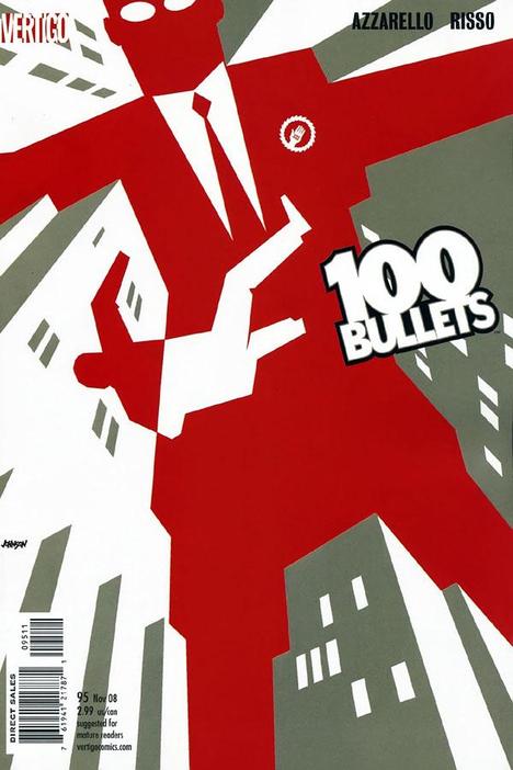
Design School
Our next category of covers is what I refer to as “Design School” covers… or covers that rely on and focus on, graphic design.
Design school covers are a super fine line to walk, because executed at the highest level, they can be super effective, eye catching, and sell a story even when focusing more on the presentation, rather than the content itself. Even with a minimalistic design approach, they can work… but on the other hand, it’s easy for them to focus solely on fancy design for the sake of fancy design and totally lose the forest for the trees.
Design school covers often complete split an audience with a ‘love em or hate em’ reaction.
Bottomline for indies, this is an advanced concept approach to play with. Only attempt it if you’re really confident, not only in the conceptualization and execution of the art (you and your artist), but of your ability to impartially judge its effectiveness. Keep in mind, one of the big things in design world, is that you always do multiple versions of things… and on big budget design stuff, those multiple versions are always tested with people to legitimately see which ones are most effective on the target audience.
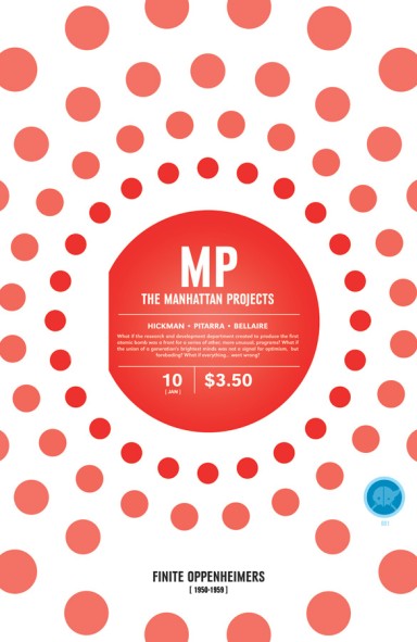
I mean seriously, the Manhattan Projects cover below with all the spheres. While I’m sure it has some meaning (lost on me since I’m not 100% familiar with the series, only read a few issues), ain’t nobody seeing that book in the store and saying, “Man, I gotta get this book, I don’t care what it is!” In fact, I would go a step further and say, if Manhattan Project didn’t have Hickman and crew on it, if it wasn’t pushed with a big marketing team, covers like that would end up in the 10 for a dollar bin faster than an atomic explosion.
Plot Previews
Taking the preview/trailer concept to the extreme, some covers really focus on the narrative plot.
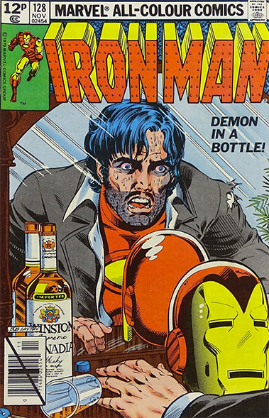
Note that while adding text outside of bubbles and captions can certainly be effective, text is not required to focus hard on narrative. This is where visual writing comes into play. Even without the “demon in a bottle” tagline on Ironman 128, we see the liquor bottle, spilled glass, and Tony’s disheveled look. Not only does this clue us in to a problem at hand, but it shows us right off, this issue is going to be something very different than a typical Ironman floppy.
Plot focused cover concepts are an excellent approach for indies as they really help attract new fans and customers. Assuming your story is something worth reading, this approach turns on the neon “open for business” sign.
ELEVATE YOUR COVER DESIGNS:
The four essential panel elements noted in the Working Writer’s Guide:
- Emotion
- Comictography
- Mise en scéne
- Movement
Of course, all of these come into play with cover design and paying attention to them will help you conceptualize a winning cover.
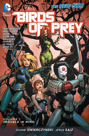
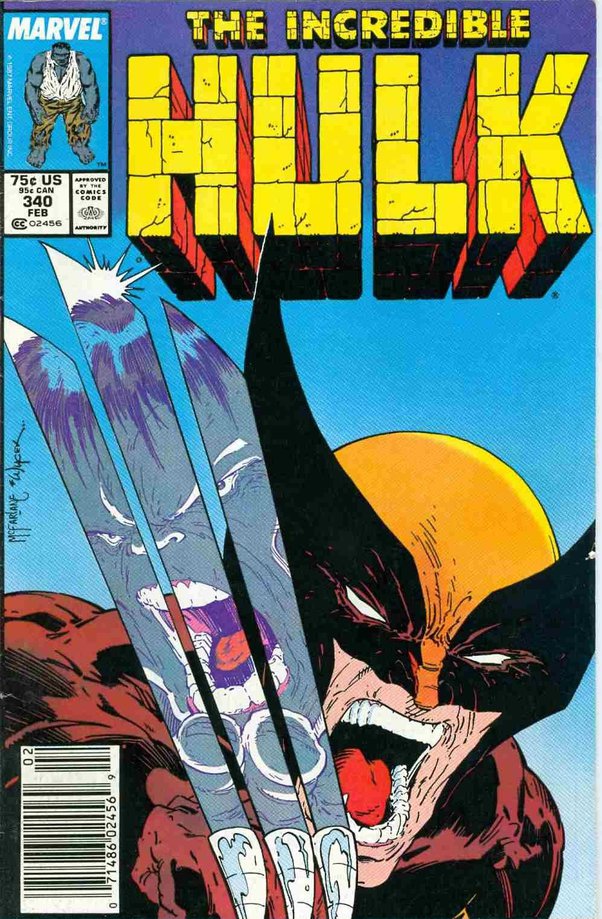
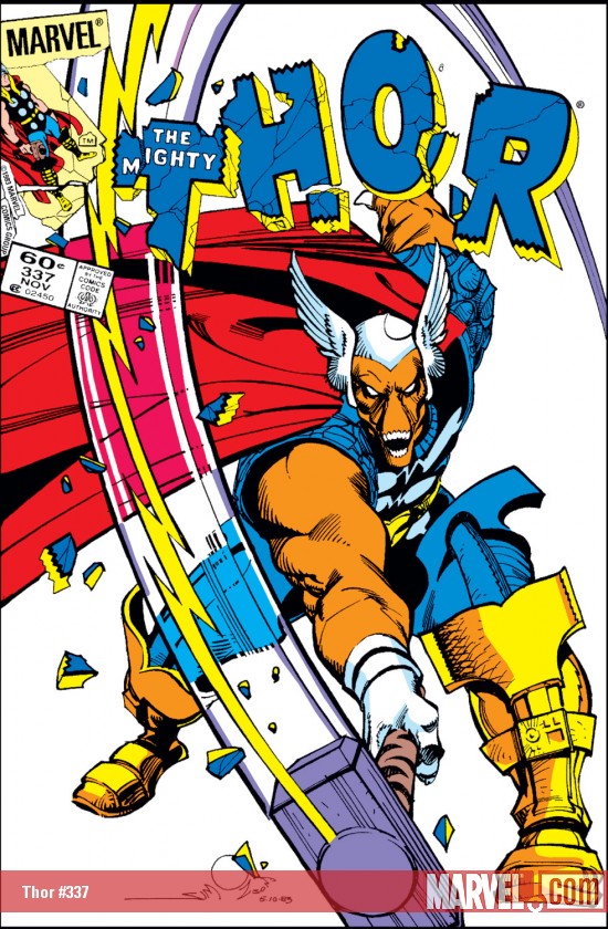
Dynamic Punch (Movement)
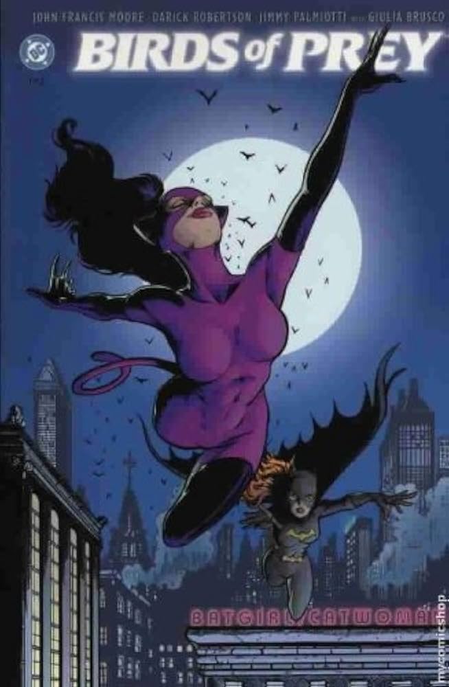
In many instances, simply adding movement, taking static portrait shots we noted earlier and putting them in motion, can drastically improve a cover. The Birds of Prey cover below is a perfect example of this. The ladies ain’t really doin’ anything, but the dynamic nature of the art makes it hard to not give a second… or third look.
Another staple in comic covers are fight covers, often where 2 portrait shots are elevated into action and movement, caught in the middle of a fight. One of the reasons this works so well, is because many comics, most super hero comics, tend to be action oriented. So the cover delivers what the reader wants, while ticking off many of the concept prerequisites we’ve noted.
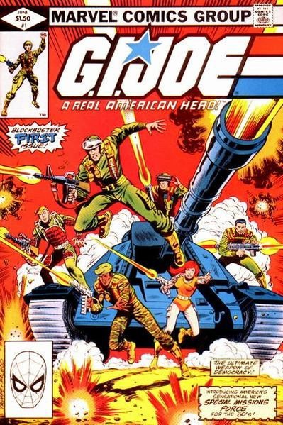
Take note of the GI Joe cover; imagine this same exact visual setup, without the gunfire and everyone just standing around the tank posing… it would be far less engaging. The movement elevates the concept.
Backgrounds Matter
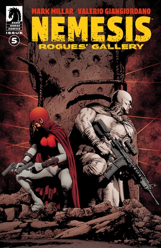
Mise en scéne is where the details live and in turn, narrative flourishes. Take this cover of Nemesis, two static portrait shots, alone there isn’t much to them. But with the chewed up structural column and laser gun sights in the background, a narrative begins to take shape.
Nick Fury in a space suit tells you something, but Nick Fury in a space suit WITH the Earth Exploding in the background, now that’s a hook.
This is one of the reasons why super simple designs are always at a disadvantage, they simply aren’t using all the resources available to them.

Emotional Impact
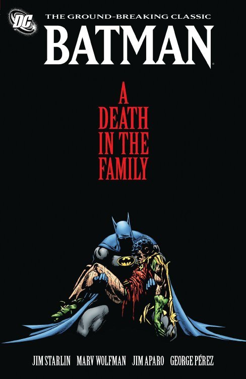
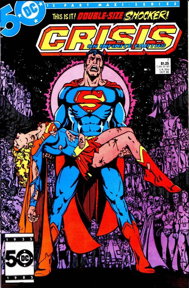
Emotional impact is a fundamental aspect of all comic art and sometimes focusing on a single emotion can deliver a message with overwhelming clarity and effectiveness… Simplistic death/grief imagery is a common route for emotional impact–of course, readers have to know your characters for this to really work.
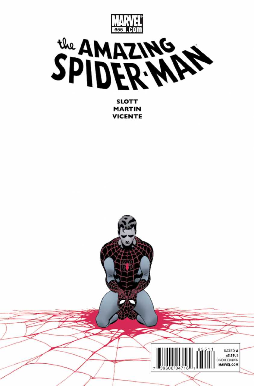
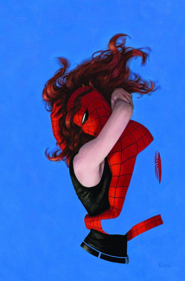
Shooting solely for Emotional Impact is a bit of a double-edged sword, because while a razor sharp message can tick all the boxes in an effective cover, it’s really a one trick pony. This is to say, you’re conveying one specific emotional message and nothing else about the narrative. The last cover of Spider Man with MJ is a good example of this, this cover speaks to the love and relationship they have, but nothing else; ultimately emotional impact covers are one note. If your audience is not particularly honed in on that emotion, a one note emotional impact cover could produce a miss!
If I had money for one comic and I was into fast-paced action comics, given the choice between Spidey and MJ embraced and two other comics with other icons brawling it up in a cool fashion, I’d probably pass on the lovey dovey cover, as cool as it is for an emotional impact design.
Striking Visuals
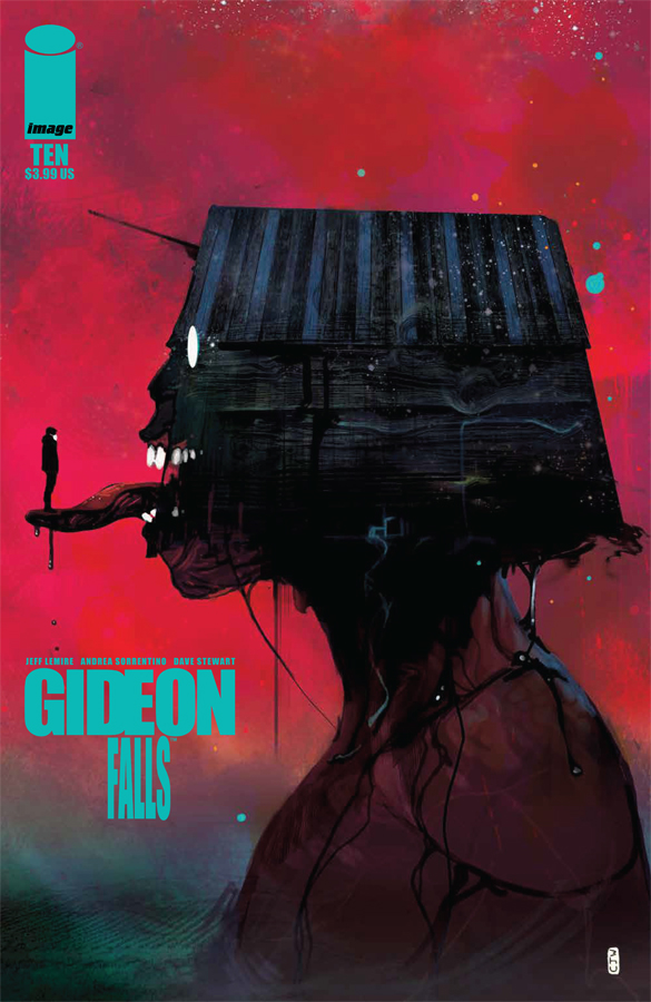
The modern trend has certainly gravitated away from narrative heavy covers, toward striking art that simply captures the feel and vibe of the book. In a sense, some of the best modern comic concepts combine a little bit of everything this page covers.

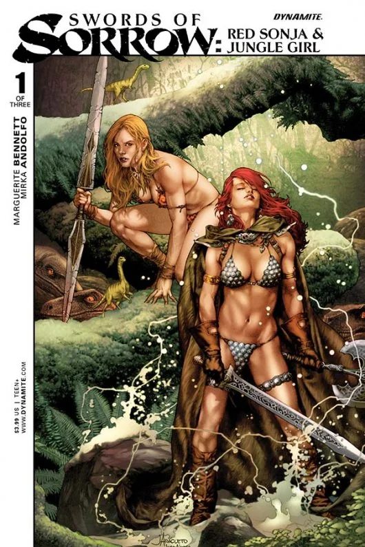
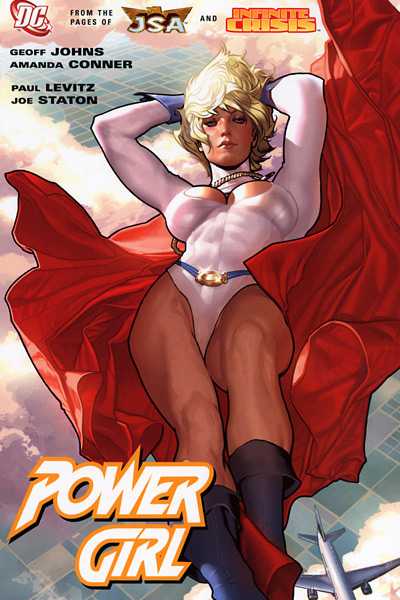
Sex Sells
I’m not gonna go too hard into this one… but the reality is, sex sells, even in 2025.
Always has. Prolly, always will.
And while the examples below showcase the ladies there are just as many sexualized examples of the men out there, with their 1% body fat, super muscular selves.
For indie comics, if you want to wield sexuality in your cover design I suggest you deep dive into what it means to be sexy and sensual and explore designs and imagery that say more with less. Basically ‘subtle objectification,’ if such a thing exists. This approach usually has the broadest appeal.
Of course, if you know your target demo and sex is a big part of your narrative, not pulling punches may serve your fanbase best.
Clever Girl Covers
Whenever I spot something clever in life, my brain immediately conjures forth Arnold Schwarzenegger from Total Recall, when he realizes Sharon Stone is trying to stall him and says, “Clever Girl.” So my title of clever girl covers has nothing to do with anything feminine, but rather, anything clever.
Anything that makes the reader take a second or longer look at the cover.
Truly clever covers are often copied. In fact, some truly clever cover designs/concepts can become iconic in their own right.
I don’t know who did the first character interaction with series title, but it can be a fun eye-catching element (adding a lot of movement), though admittedly, is typically reserved for issues later in a series run.
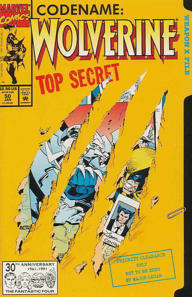
Since the golden age, comics have taken the “clever girl” concept beyond visual design itself and applied it to the physical design. No greater time captures this step (or misstep depending how you look at it), than the 90’s with chromium, foil, glow-in-the-dark, popup and whatever other clever printing gimmick they could think of.
I’m gonna showcase Wolverine 50 below, where Marvel used a claw shred die cut in the cover concept, but mostly, with Clever Girl designs, I’m talking less about physical print gimmicks and more about actual clever artistic design elements, especially ones that express or support specific narrative elements.
Arguably, the strongest narratives are the ones that give a turn or reveal at the end, which completely set a new light on the narrative. In turn, readers are able to go back and reread the entire story from a new perspective. Adding a clever aspect to a cover that encourages repeat viewings follows this same vein–even a quick second look at a cover could be all that’s needed to make a sale.
Having a clever element in your cover concept also lets the viewer know, you’re working at a deeper level, striving to surprise them. Most folks will appreciate that.
Actions Speak Louder than Words
Everybody knows the adage. And it’s just as true in comic covers as it is anywhere else.
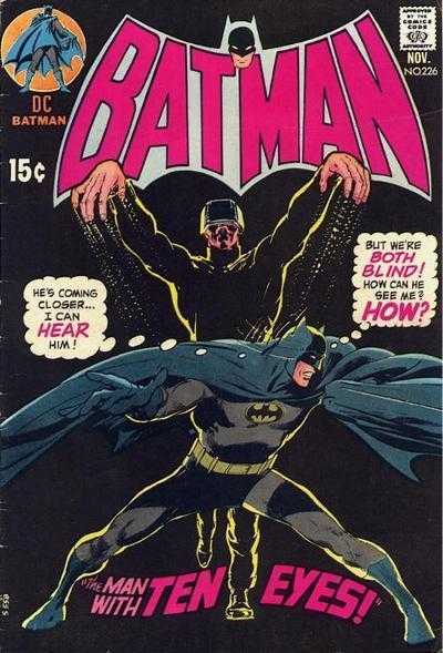
Instead of showcasing your hero as a standing personal portrait, like the Batman and Robin cover above… you can elevate the concept by having your hero actually doing something.
Of course, talking on a cell phone is just as boring as standing there with a grin… so when you think of actions speaking louder than words, conceptualize actions that actually say something.
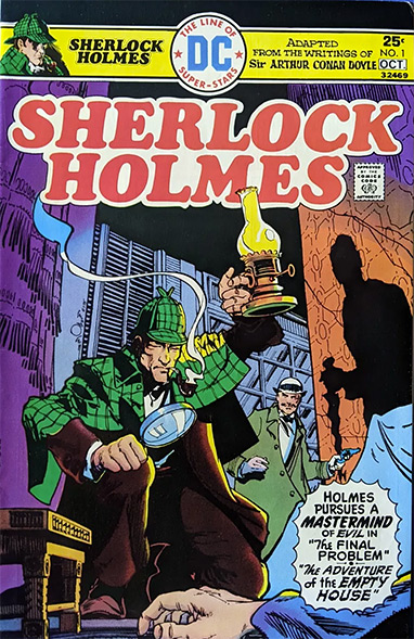
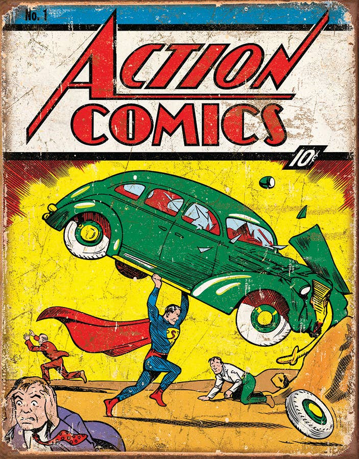
You don’t have to look anywhere else but Action Comics #1, where Superman isn’t posing with his hands on his hips, but rather lifting the green car. Sherlock Holmes lowers himself to examine a clue with his magnifying glass. The Daredevil (in an emotional impact cover), clings to the tombstone, not simply posing next to it for the camera, or relying on a speech bubble to express his grief.
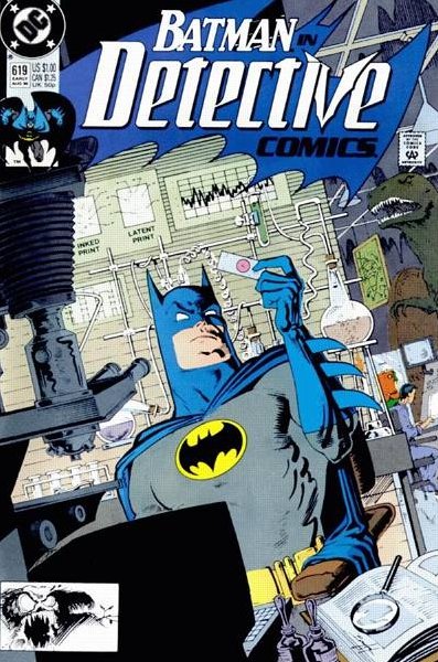
Ultimately, what you’ll find is that your characters will often take actions of what they do. Batman on one of the covers above, working in his Batcave lab, Superman, saving people by lifting heavy things, Holmes investigating and thinking through problems, etc. Showing your characters actively involved in doing what they do best, is often more engaging then simply showing them just for the sake of showing them.

Which leads us directly into our last point and a bit of the secret sauce…
Missing Moments
When it comes to showcasing your hero “doing something,” a super effective method of choosing what they’re doing is to look to the climaxes of the book.
This can be the actual third act climax, or really, any important scene climax within the book.
In the Robot Kids manga I showcase in Storycraft for Comics, Kai, a soldier on a far-off world, tasked with putting down a group of rebels. Stranded in a surreal alien jungle, Kai gets the idea to climb a massive Red Wood size tree and try to get a signal on his communication device at the tree’s crown. His rebel traveling companion, Molly, warns him not to do this as the trees are home to “Forest Spirit Warriors” who are really territorial.
So Kai ignores her, climbs up, tries to get a signal, but gets attacked by the spirit warriors before he can get a response. They fight a bit and wind up jumping out of the tree.
I call this approach to cover design, missing moments because once you identify the climax, you look to showcase a moment outside what’s actually captured in the book.
In the case of Robot Kids scene I’ve described, my missing moment showcase might be;
- Kai climbing an impossibly tricky spot on the tree (think of Tom Cruise free climbing in Mission Impossible) carrying his comm equipment OR,
- Kai already at the top of the tree, programming his comm equipment to receive a signal, while the spirit warriors gather in the shadows below him OR,
- Maybe he’s shooting some sort of antenna into the air, while the branch he’s on cracks (the latter detail for added jeopardy).
While the creative expressions here are near endless, the important part is that I’m taking a climatic moment from the story and showcasing something the character does that happens outside the moments actually shown in the book.
Generally speaking, duplicating an image on the cover that directly appears in the interior, is not something you want to do.
But showcasing an extra moment of something seen in the interior, highlights that thing and further engages the reader.
If you conceptualize your cover from a missing moment, keep this one rule in mind.
Don’t allow the missing moment to deliberately mislead the reader OR, open narrative possibilities that detract from where the narrative actually goes.
For example, if you show a character bleeding from a gun shot wound but that character never gets shot, that’s misleading.
In my Robot Kids example, if I had Kai use micro glider wings to hover above the tree–then never showed him using his micro-glider in the comic, people would question, “where are those glider things?” “How come he doesn’t use them to get out this situation, or that situation?”
While you can take creative liberties, focusing your emphasis of a cover on mood, tone and all the other things we’ve talked about, a cover should never contradict the story within, or present some sort of alternate version of things that never takes place.
Spend time conceptualizing your covers.
Avoid reaching for the lowest hanging fruit.
Keep these tips and references in mind and whatever approach you take, work towards elevating your design. Strive to express multiple elements about the story and you’ll have far more people clicking ‘buy now’, then swiping left. ▪
About the Author —
If you enjoy this article, please share the direct link on your social media.
Newcomer or veteran writer, if you’re working on a project that needs commercial success, Nick urges to you read this intro article. And for every writer putting eyeballs on this, why haven’t you picked up my genre guide yet?
Nick Macari is a full-time freelance story consultant, developmental editor and writer, working primarily in the independent gaming and comic markets. His first published comic appeared on shelves via Diamond in the late 90’s. Today you can find his comic work on comixology, Amazon, and in select stores around the U.S.